Mad Radish Rebranded Design System
The Challenge
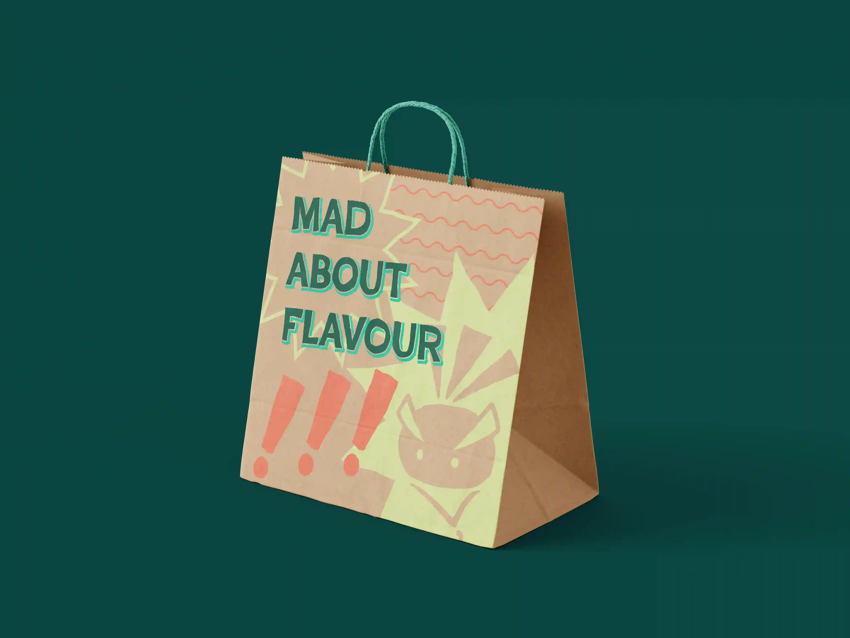
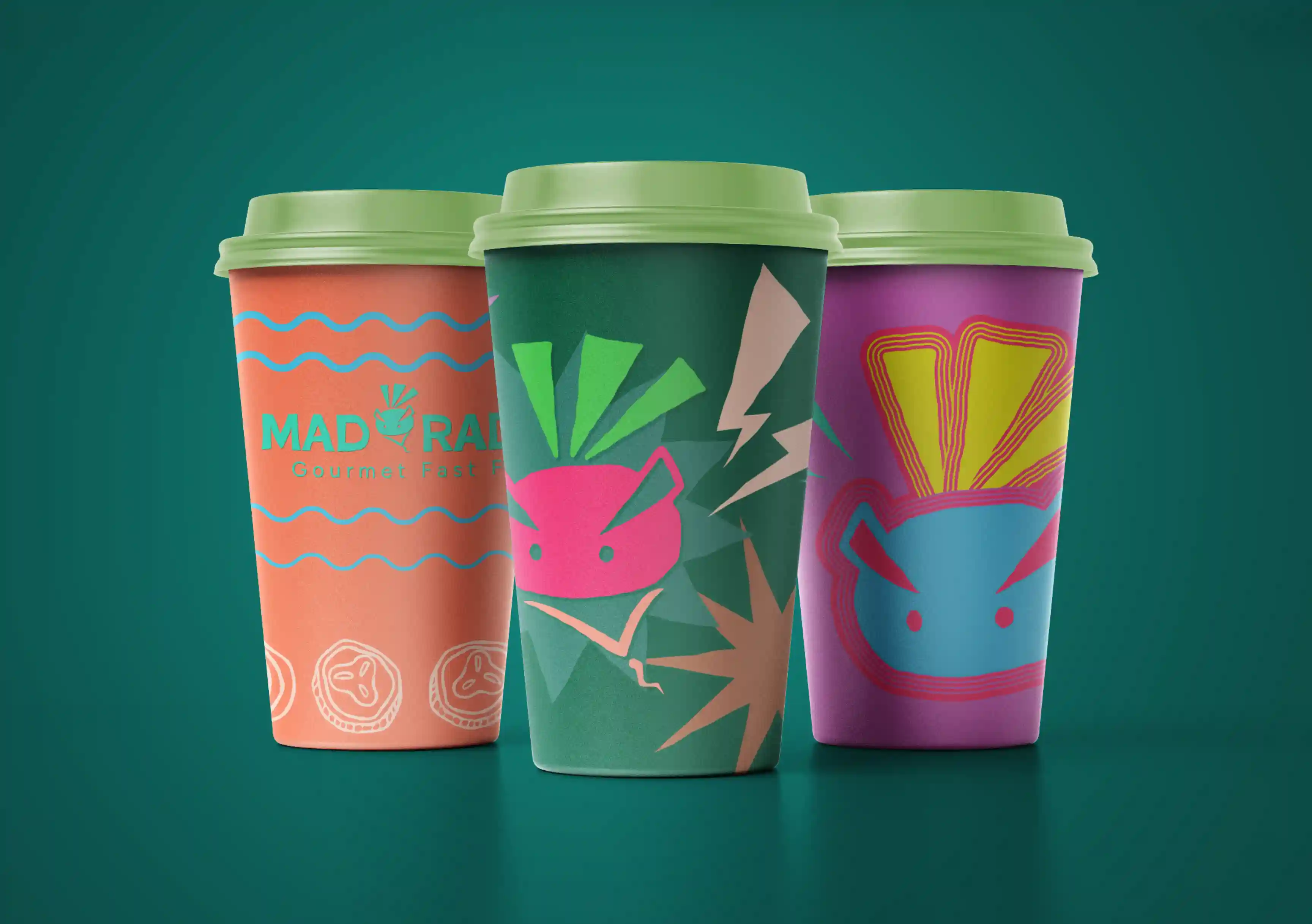
This project began long before I was given the assignment. For the past couple of years, my friends and family have all been subjected to my strong opinions about the branding for the restaurant chain Mad Radish. The brand identity is certainly executed well and professionally, but my problem lies with the fundamental idea that a cool blue should not be the one and only colour defining a restaurant that aims to get a consumer base excited about vibrant, healthy, flavourful, and what I can personally attest to as delicious, food.
The Approach
When I begin the branding process, I like to write down a list of adjectives and/or concepts that are pertinent to the brand on the side of my sketching area. Sometimes, as seen here, this results in ideation on the spot; mostly, it helps me keep the big picture in mind as to what I am hoping to accomplish with my design.
Here, I had a specific logo Idea already buzzing at my fingers and tried an array of variations to see if I could realize it properly.
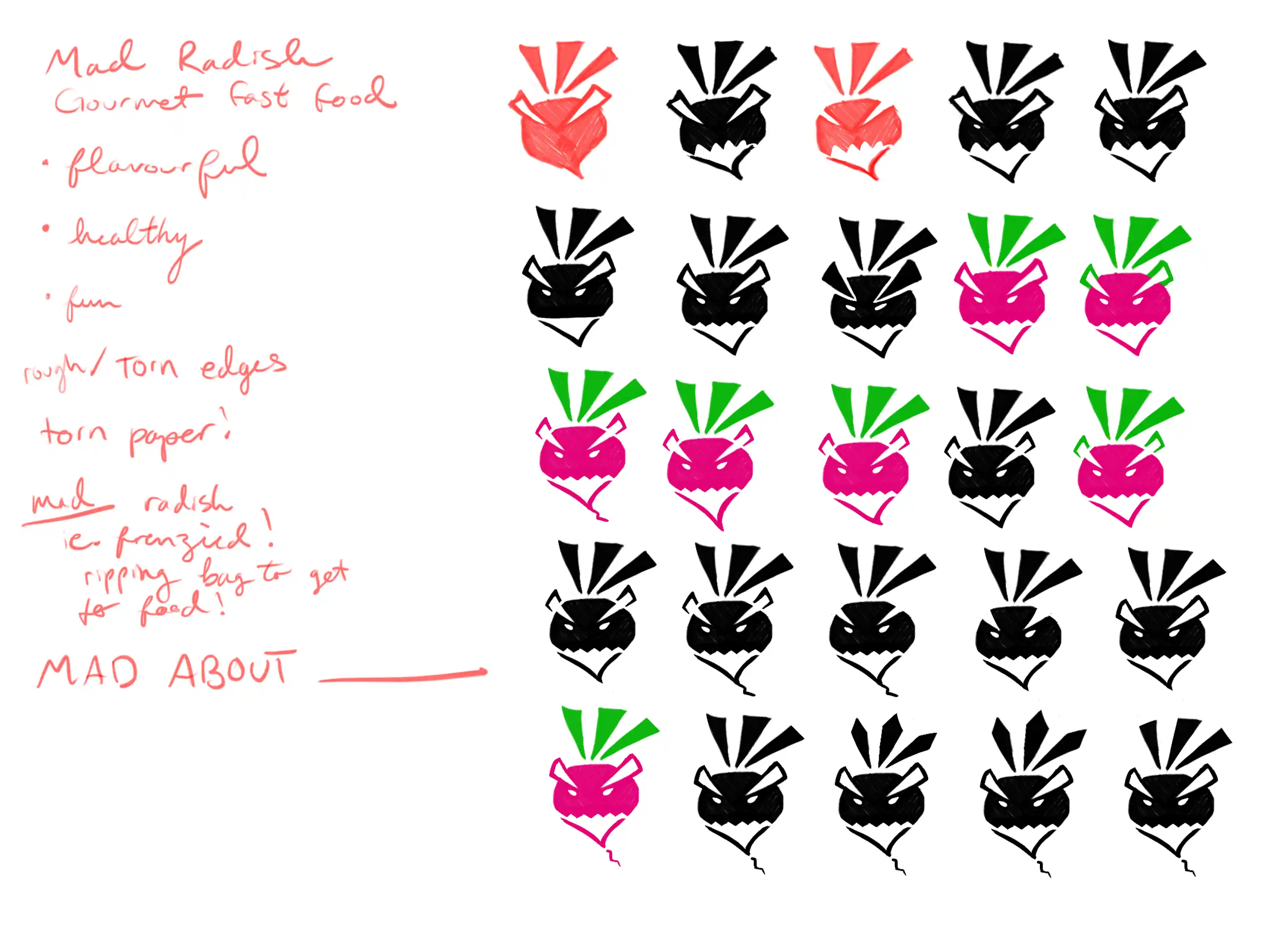
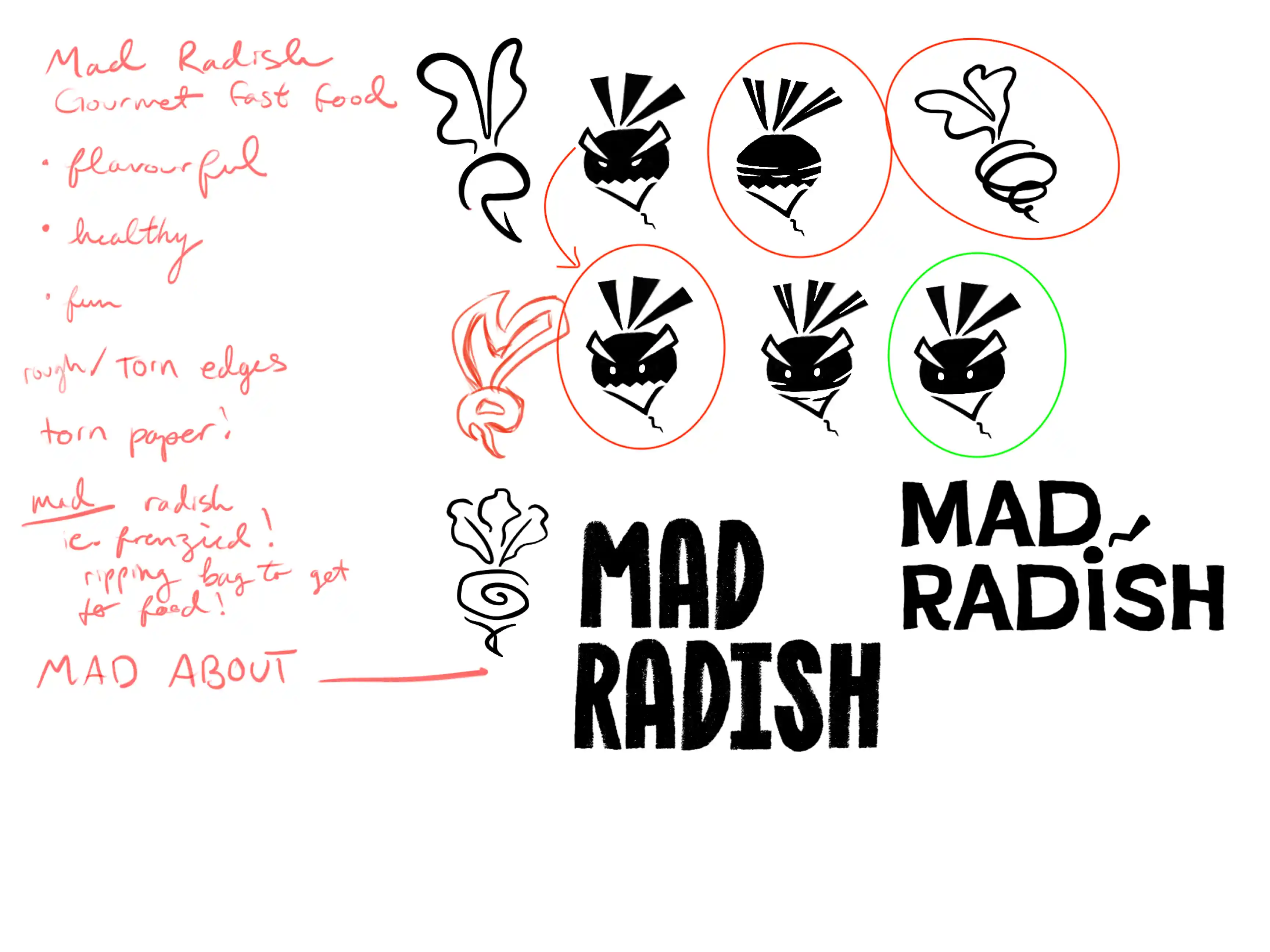
Once I felt I had played that out enough, I then challenged myself to abandon the original idea and come up with a few more. This usually results in a mixed bag of ideas, but I'm ultimately left with a few different options that I find it difficult to choose among.
At this point, I find it helpful to consult some friends or family members to hear outside perspectives. This time, they confirmed what I already Identified as the strongest three choices, and it was their input that led to the decision to try changing the angry radish’s eye shape.
The Solution
I decided, ultimately, on the symbol with a touch more personality. If I had been able to consult a client, I likely would have presented them with a secondary option using the spiralled radish icon, my second choice.
I instinctively felt that red (off-red) and green would be choices better suited to this branding, but food branding is deeply psychological, and so I looked into some research. As it turns out, there are several studies confirming (in different contexts or wording) that red is an impactful and appetizing colour, and green, of course, connotes health, vegetation, and freshness.