Beer Can Design and Advertising

The Challenge
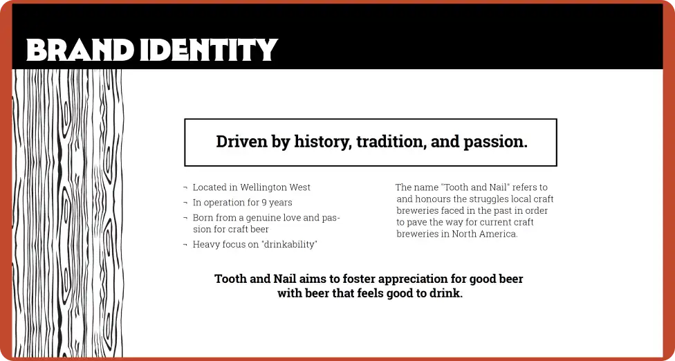
For this project, I selected local craft brewery Tooth and Nail Brewing Company to focus on while developing a pair of Ottawa-inspired beers, their can designs, and a supporting marketing campaign.
The objective was to expand on Tooth and Nail’s existing visual language by creating designs that felt like their “fun uncle”: familiar, but bolder, looser, and more celebratory. The brief imagined a special-release duo launched for a milestone event, connected through flavour, naming, and a distinctly Ottawa identity.
The Approach

I began by analyzing Tooth and Nail’s existing brand to understand its visual language and the tone behind its illustrations. That foundation led me to a concept celebrating Ottawa businesses of the past—a commemorative duo inspired by the city’s history and by Tooth and Nail’s own “fight for a place” in the local beer scene.
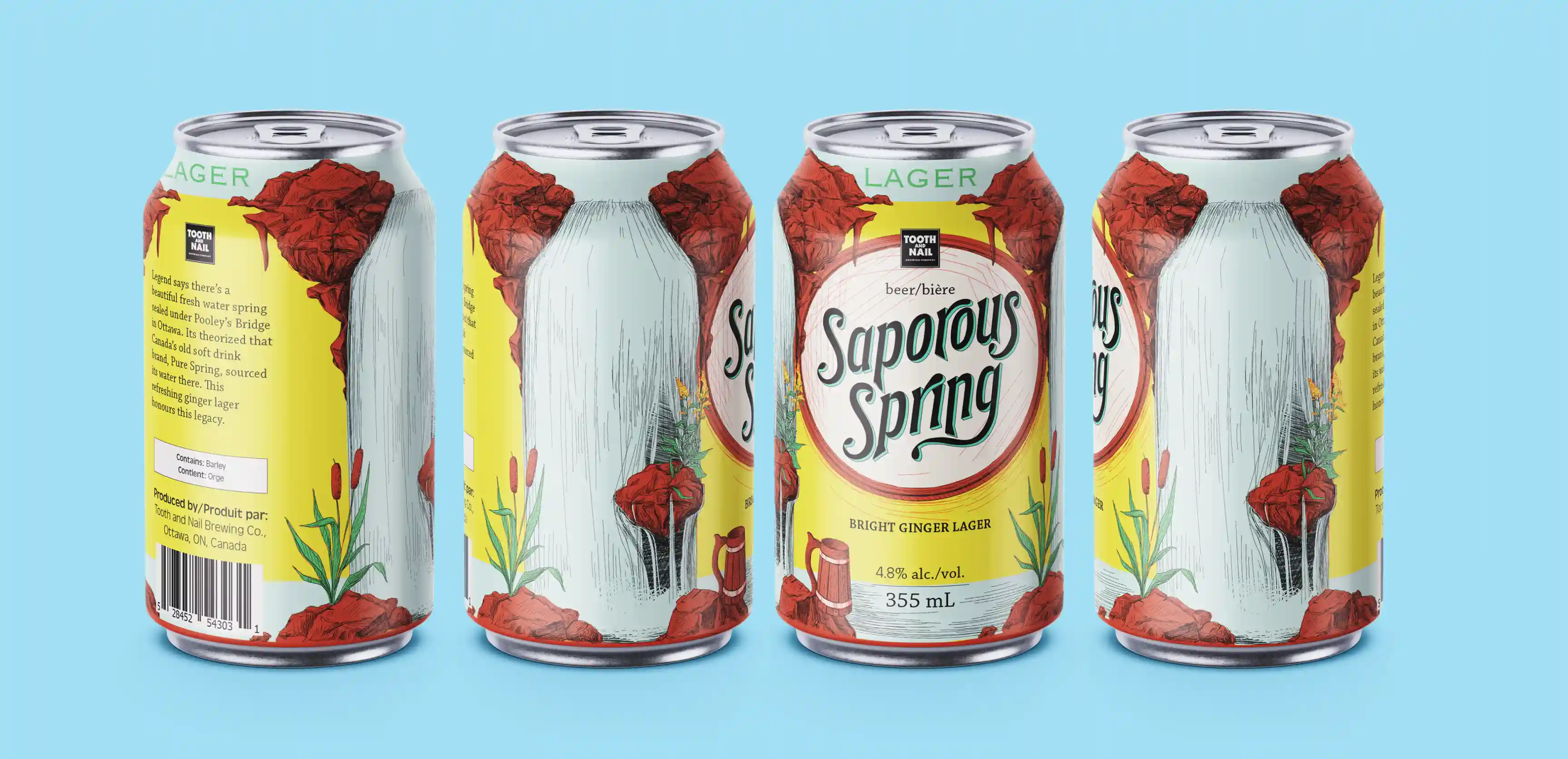
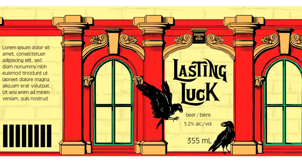
I selected Poulin’s Dry Goods and Pure Spring Ginger Ale for their strong visual legacies. Their corresponding brews became “Lasting Luck” and “Saporous Spring,” each rooted in the character of the business that inspired it.
With these references, I developed an approach that expanded Tooth and Nail’s small, isolated illustrations into full-can panoramic scenes. Each design uses a two-part structure: larger front and back panels for key information, and repeating illustrated side panels that create a seamless, looping pattern.
Early tests explored colour and rendering style, including a more graphic, vector-based approach.
The Solution
Ultimately, I shifted toward an illustration style that better aligned with Tooth and Nail’s original cans, keeping the new designs playful while staying true to the brand.